1. The task
We were approached by an SEO company to rebrand an existing multi-page site, as well as to develop two new landing pages.
One of them was a page for the website development department.

We were approached by an SEO company to rebrand an existing multi-page site, as well as to develop two new landing pages.
One of them was a page for the website development department.
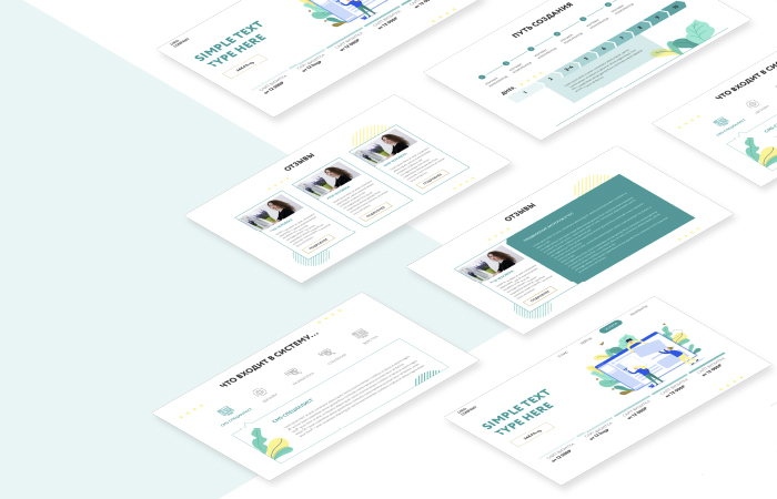
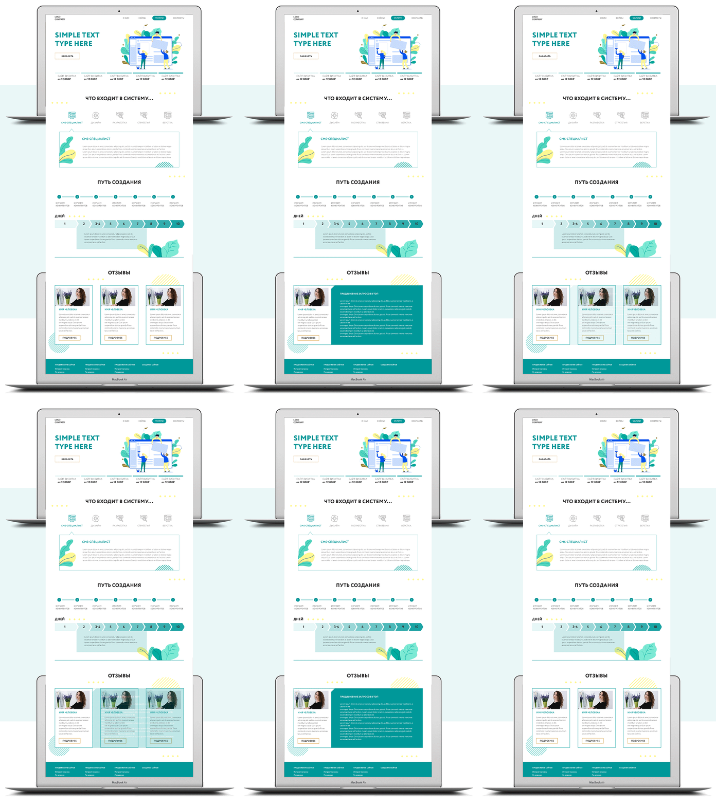
The landing page included:
- main screen with a menu and block of different variations of services and their cost;
- second block: a listing of the stages of work and their brief description;
- third block: the work plan is schematically described, the number of days for each of the stages and what is included in it;
- reviews from clients;
- footer with all contacts, other useful sections, work hours and links to social media.


As color design for landing page, were used light and non-intrusive colors in order to maximize the airiness of the composition and ease of perception.
The schemes used shade transitions from lighter to more saturated to show the dynamics of development and consistency.
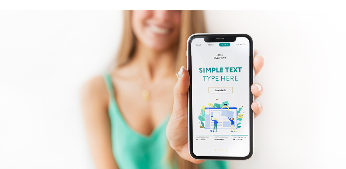
The final version of landing page was adapted for mobile and tablet versions.


|
|
Thank you for the application. We will contact you soon