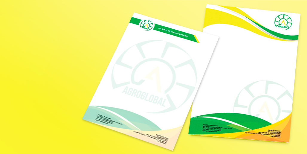
Agroglobal

- branding

кейс
кейс

1. the task

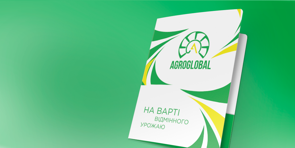
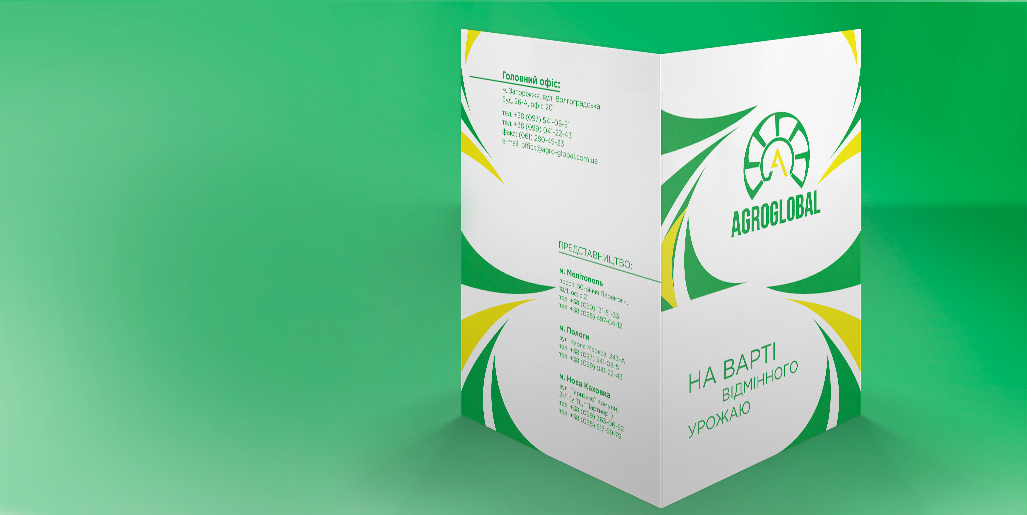
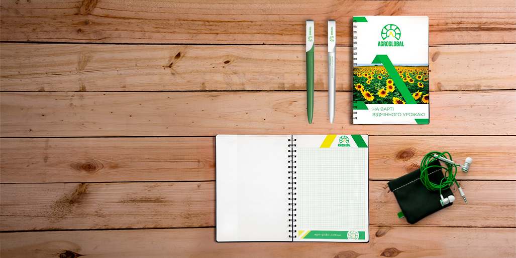
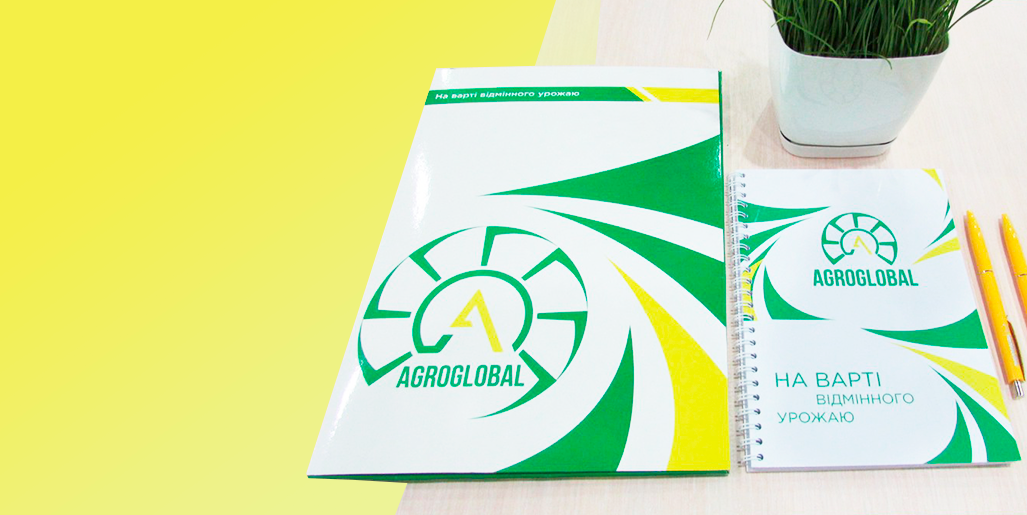
Agroglobal is a company that produces control over the quality of seed and is responsible for the safety of the crop. Agroglobal is the official certified dealer of leading world brands and the largest manufacturers of Ukraine.

The main task is to rebrand the logo and to create a new corporate identity with basic elements for the company documentation and posters.

2. The Strategy

Initially, as an image of a warm sun - an integral part for growing plants, we used the yellow sunflower petals for logo's framing.
The “A”, as the capital letter in the name “Agroglobal”, framed with 7 sickles, which in turn are elements of the harvesting machines used to harvest cultivated plants.

Primary colors: warm yellow and bright green, the color of spring grasses - as a symbol of the sun, energy and life.

кейс
кейс

3. the results

The combination of straight lines and sharp corners, at the same time is forming a smooth circle, is the main feature in this style. This is a display as an indicator of confidence in your product and at the same time a manifestation of customer care.

кейс
кейс
кейс
кейс
кейс
Would you like
to make an order?