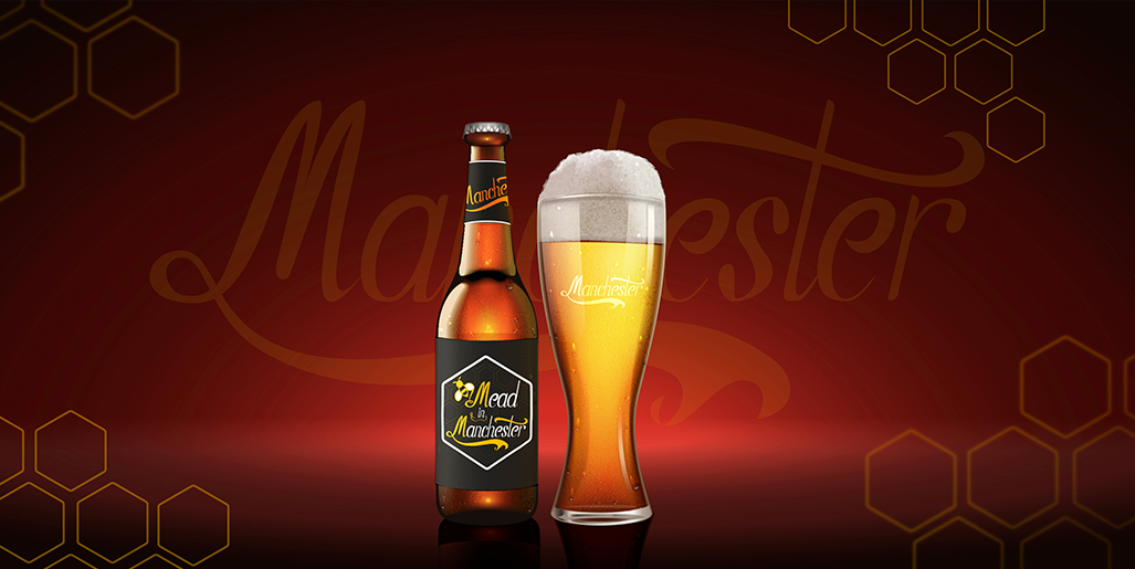
Mead in Manchester

- branding

кейс
кейс

1. The task

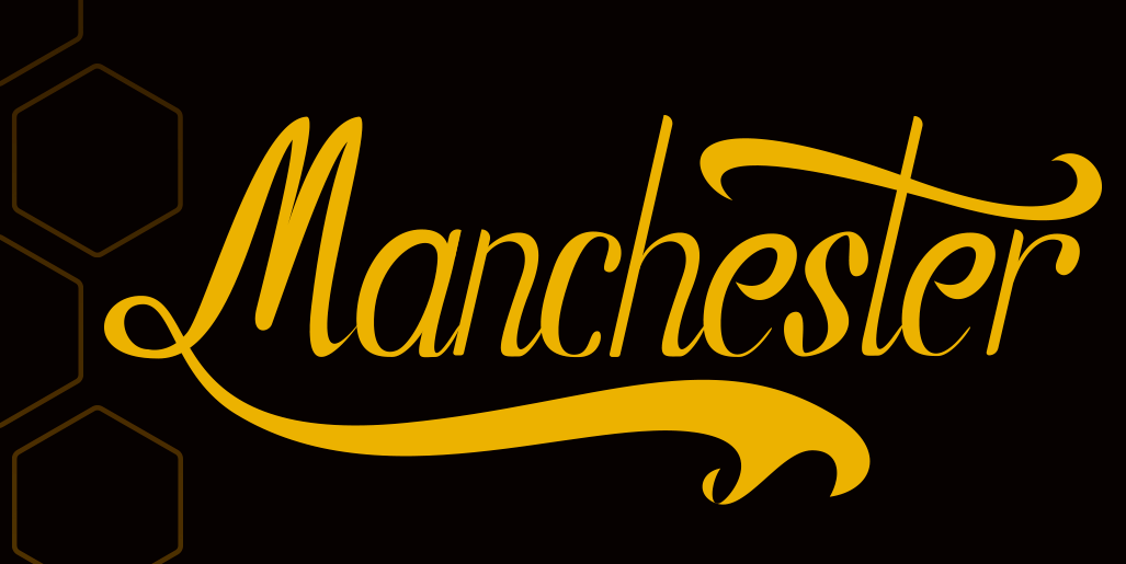
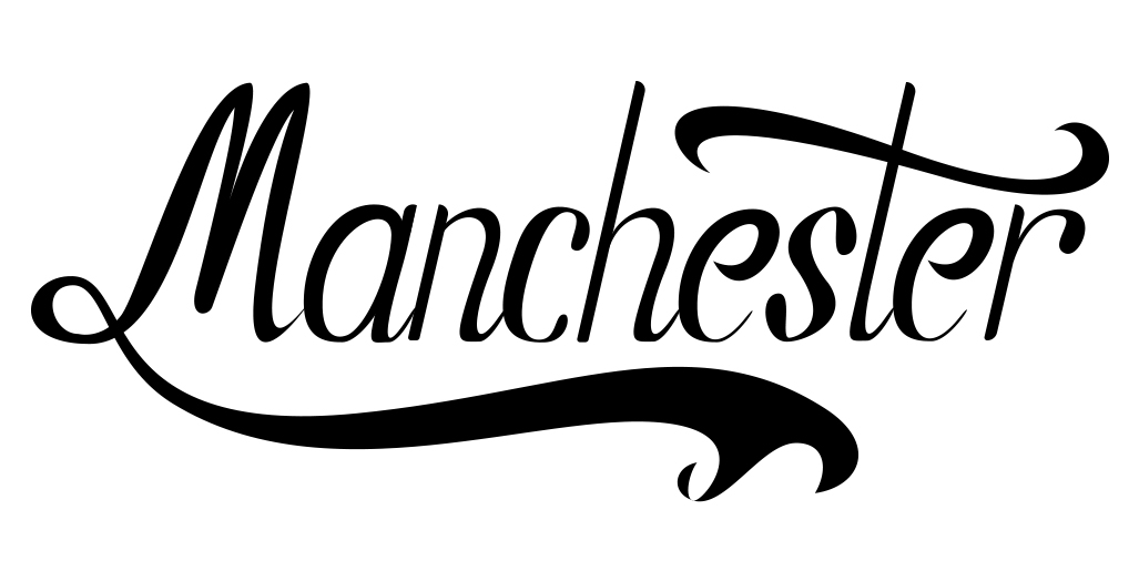
Logo and label design for a private brewery in Manchester.
Since the bee is the symbol of the city, it was stated during the development of the style to use this attribute.

The phased development of the logo from the old style to an improved combination of minimalism and modernism was completed as soon as possible.

2. The Strategy

The initial calligraphic drawing of the inscription "Manchester" was carried out, with the further addition of attributes in the form of a bee and honeycomb.

These colors have become the basic component in the concept of branding.

кейс
кейс

3. THE RESULTS

After retro calligraphic style was designed.
A new version with flat graphics was introduced.
Later it was definitely to use both options for different taste products.

кейс
кейс
кейс
Would you like
to make an order?