2. The Strategy
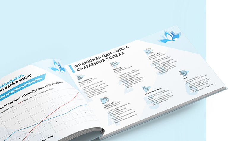
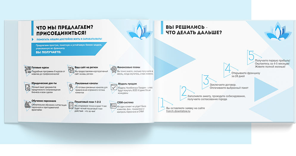
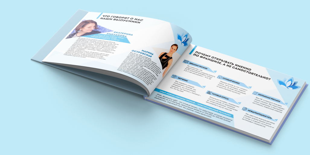
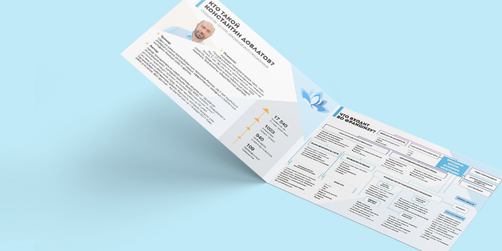
Having studied the specific policy of the target audience, we proceeded from their interests and needs. We focused on the design of the colors from dark blue to light, where dark shades show stability and unity, while lighter tones represent lightness, health and relaxation. At the same time we preserved the basic concept with depth and space characteristics for particularly niche features reflected in a polygonal style that prompts action and development.
Blue is the color of tranquility, easy on the eyes. He also gives a person a sense of trust and security. This is one of the main goals that we pursue in this project. These same properties are central to the creation of corporate design.


